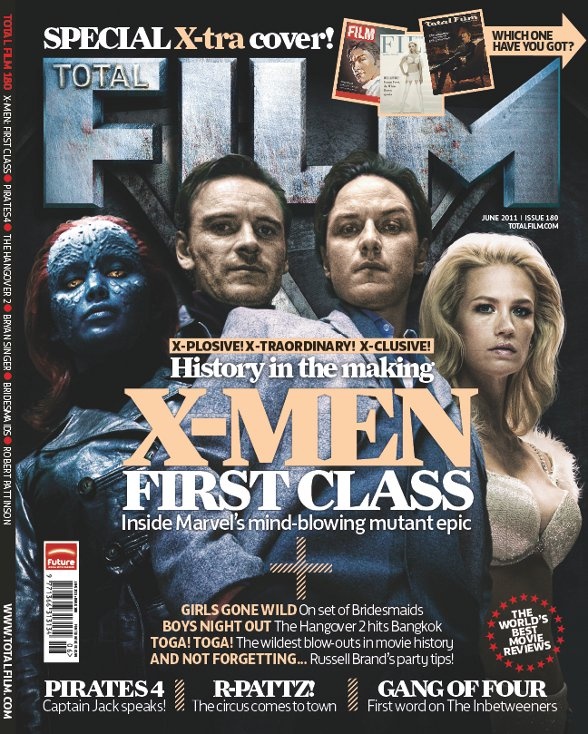
This is an example of a film cover from the magazines 'Total Film'. The title looks like it is made out of metal, which makes an impact and makes the letters stand out. The title is quite big and takes up about a third of the page. This allows the reader to easily read the title. However the people on the front of the magazine are covering part of the title which shows that they are the main focus. The font all seems to be the same which is unusual for magazines as they use two or more different fonts on the front cover. The colours of font only use two colours white and peach. From my research into magazine covers I’ve concluded that magazines use two colours of fonts, usually white and another colour. The background of the cover is very dark and it looks like there is an X in the background. It looks like the Cerebro door from the X-men films, which fans would recognise. The text has a theme of ‘X’ on it, with words such as ‘X-plosive’ and ‘X-tra’ which is a pun of the title X-men First Class. The text on the cover seems to go in a ‘G’ shape with text at the top, side and in the middle expending in front of the actors advertised. There are four actors advertised on the cover which is very unusual because there is usually only one or in some cases two, but four is strange. They are all using the Gaze, the romantic or sexual pose. There are two men and women which makes the magazine appeal to both males and females. One of the women is a mutant which informs the audience about what the film would be about if they are oblivious.
Some clear points made here including your analysis of the words, fonts and colour, Amara. Try to use this to inform your own magazine's development.
ReplyDeleteMrs H